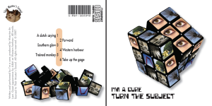
Probably the most difficult assignment for me was creating a CD Cover. Where to find inspiration? I really had no clue and it took me quite some time to develop some ideas. One of them looked extremely difficult and laborious for someone that never worked with photoshop or illustrator before. Despite that, it was that idea that quickly started gaining result.
I started using a picture of a rubik’s cube as found on wikipedia, and taking this picture as a framework for the front cover. For the picture at the back, I actually broke down a rubik’s cube, made a composition of the parts, took a photograph of it, and used that as a kind of drawingboard.
 Overall, I am very pleased with the outcome. It is combing the realism of the cube with a bit of the surrealism of the pictures. It might look like just some pictures and words, but the truth is that every picture and word tells you something about my life at this time. Everything in this design has a meaning. P.e. there are six pictures used, one for each side of the cube. The six imaginary tracktitles reflect these six pictures.
For people who know me well, and stood very close to me in the past year, it shouldn’ t be that hard to recognise a part of the meaning of all this symbolic. And if you do so, please know that I really appreciate you and the support you give to me!
Credits for the picture of the mixer go to Evemex.
